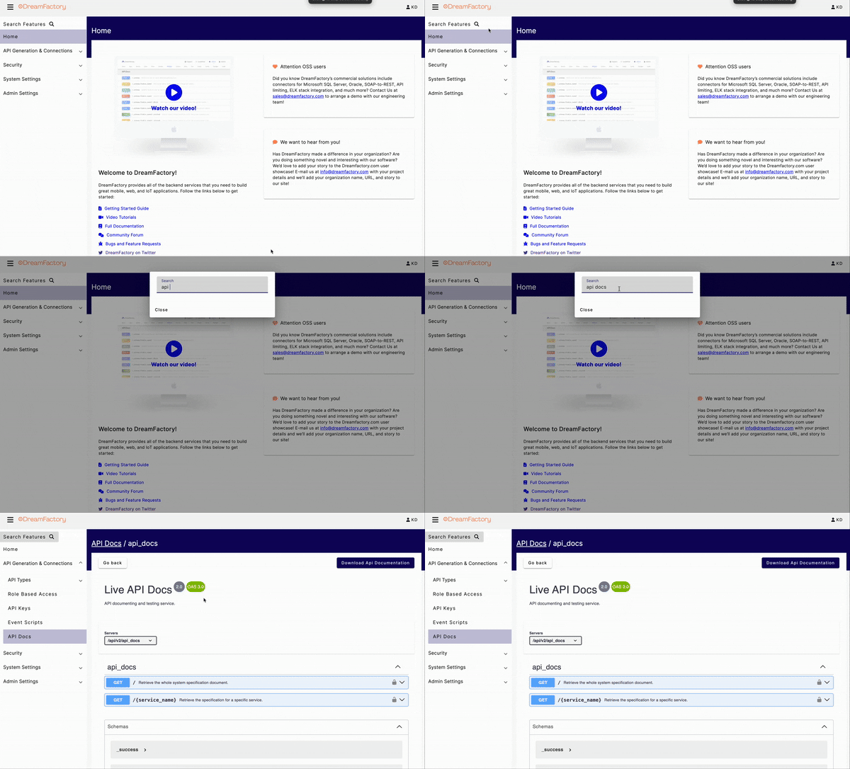
This blog article outlines the significant changes and improvements introduced in our platform's latest DreamFactory UI update. The update is designed to enhance user experience, improve usability, and provide a fresh and modern look and feel.
1. Overview
The UI update represents a significant step forward in improving our platform's overall usability and aesthetics. It addresses user feedback, optimizes performance, and introduces new features to meet the evolving needs of our user base.
2. Design Update
The following are the major changes introduced in this UI update:
2.1 Redesigned Interface
- A completely revamped layout for a more intuitive and organized user experience.
- Modern design with a simplified interface to streamline your projects
2.2 Enhanced Navigation
- New Search bar functionality to breeze through the platform
- Reworked logic to make the UI more performant whether you are managing a single API or hundreds

2.3 Performance Optimization
- Refreshed API documentation to provide a clean testing interface
- Event Scripting quality of life improvements to remove clutter
2.4 Color Scheme
- A refreshed color palette that aligns with current design trends.
- Improved contrast and color choices for readability.
2.5 Typography
- Updated fonts for improved readability on various screen sizes.
- Consistent typography choices for a cohesive look and feel.
3. Changes to Support Channel
Astute users will notice that the Intercom widget has been removed from the UI. Rest assured you can still reach support at dspsupport@dreamfactory.com.
4. Bug Fixes
The UI update includes fixes for various bugs and issues reported by users. These fixes enhance the stability and reliability of the platform. A complete list of fixed issues can be found in the release notes.
Want to give it a spin? Talk to our engineers to try it on-premises, or try free it in our lab!
Kevin McGahey is an accomplished solutions engineer and product lead with expertise in API generation, microservices, and legacy system modernization, as demonstrated by his successful track record of facilitating the modernization of legacy databases for numerous public sector organizations.


 Blog
Blog
